5 min read

The Power of User Interface Icons for Faster User Understanding

The Power of User Interface Icons for Faster User Understanding
9:17

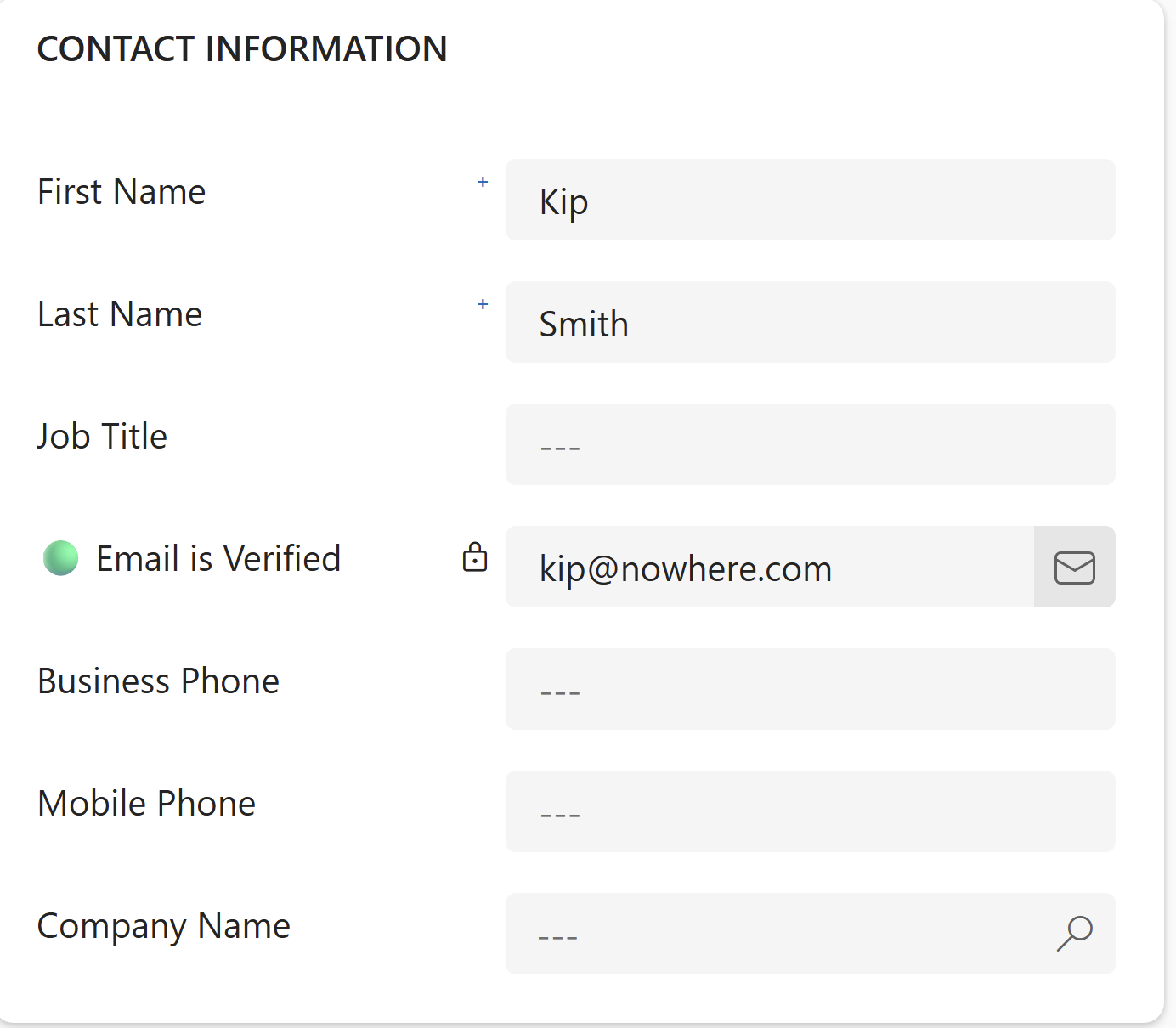
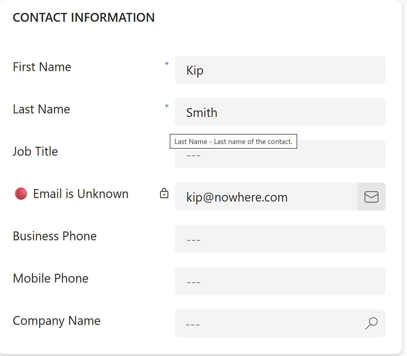
User interface icons aren't just visual decoration—they're the fastest route to user comprehension, cutting through complexity to help people take action without hesitation. I recently had the opportunity to assist a client who's sales people wanted the ability to quickly determine if an email address was valid or not so as not to waste time sending emails to bad email addresses. Sure, I could have added another field or two, but changing the label dynamically and using color icons allows the user to determine validity much faster than reading another field. Look at the example below and you will quickly see what I mean.


Email-Verified
Email-Bad


As you probably experienced, the green and red colors told you everything about the validity of the email address without even thinking.

Why Icons Communicate Faster Than Words Ever Will

If you think about it, the human brain processes visual information exponentially faster than text. Your team doesn't need to read, interpret, and then act—they see an icon and immediately understand what it means. That's not just convenient. It's the difference between hesitation and instant action.

From my experience working with Dynamics 365 CRM implementations across dozens of organizations, I've watched users struggle with text-heavy interfaces where every button requires reading and mental translation. The cognitive load adds up quickly. When you replace a button labeled 'Submit Customer Support Request' with a universally recognized help icon, users don't think—they just click. Or in the case for this client, is the email I am going to send getting to them or am I wasting my time.

Icons cut through language barriers, literacy levels, and even departmental jargon that plagues most CRM systems. A magnifying glass means search. A trash can means delete. A pencil means edit. Your sales team in Texas and your operations team in California interpret these symbols identically, instantly, without training.

The pattern we're seeing is that visual processing happens in the brain's occipital lobe in roughly 13 milliseconds, while reading text requires sequential processing through multiple brain regions. Icons leverage pre-attentive processing—your brain recognizes shapes, colors, and symbols before conscious thought even begins. That speed translates directly into faster form completion, reduced errors, and higher user adoption rates across your Dynamics 365 CRM.

Where Icons Work Best in Your CRM and Sales Tools

Repetitive actions are where icons deliver the highest return. Your team performs certain tasks dozens of times daily—updating deal stages, logging activities, sending follow-up emails, creating new contacts. Icons on these frequently used functions reduce cognitive load significantly because users build automatic associations through repetition.

Navigation menus benefit enormously from icon integration. When your Dynamics 365 form includes a left-side navigation bar or top menu, icons help users scan and locate sections without reading every label. A calendar icon instantly signals scheduling functions. A dollar sign indicates financial data. Users develop spatial memory—they remember the location and shape of the icon, making future navigation even faster.

Status indicators and visual flags work exceptionally well with iconography. Rather than forcing users to read 'Approved,' 'Pending,' or 'Rejected,' a simple color-coded checkmark, clock, or X communicates status instantly. Your operations team can scan a list of fifty records and immediately identify which require attention without reading a single word.

Action buttons on forms—submit, cancel, edit, delete, duplicate—should always include icons alongside or instead of text labels. I've watched form completion times drop by 30% or more when organizations replace text-heavy buttons with clear, universally recognized icons. The key is pairing high-frequency actions with high-recognition symbols, then testing ruthlessly to confirm users interpret them correctly.

Common Icon Mistakes That Slow Down Your Team

The most damaging mistake is icon overload. No one wants a CRM interface where every single element has an icon—form fields, labels, section headers, buttons, status indicators. At that point, the visual noise becomes overwhelming and icons lose their effectiveness. Users can't distinguish what's important because everything screams for attention.

Inconsistent icon usage creates confusion and erodes trust in the interface. When a pencil icon means 'edit' in one section but opens a notes field in another, users develop hesitation. They stop trusting their instincts and start second-guessing every click. Consistency across your entire Dynamics 365 platform isn't optional—it's the foundation that makes icon-based navigation work.

Using obscure or overly abstract icons forces users into guesswork. A three-dot vertical menu (kebab menu) has become standard, but what does a hexagon with diagonal lines mean? Or a circle with three overlapping squares? If you can't explain the icon's meaning in two seconds without referencing your brand identity or internal terminology, it's probably too abstract for practical use.

Another pattern I see frequently is icons without adequate size or spacing. When icons are too small or crammed together, users—especially those with vision challenges or working on mobile devices—struggle to tap accurately. This leads to misclicks, frustration, and eventually users abandoning the icon interface entirely in favor of workarounds. Your icons need breathing room and sufficient size to function effectively across devices and user capabilities.

The Gap Between Icon Design and Actual User Recognition

Here's the reality: not all icons communicate clearly. I've seen Dynamics 365 forms cluttered with custom icons that look clever in the design phase but leave users completely confused in practice. Just because your design team understands what a stylized geometric shape represents doesn't mean your sales team will.

Proceed carefully when selecting or designing icons for your user forms. The most effective icons are those that leverage existing mental models—symbols users have already encountered and internalized through other software, mobile apps, or everyday life. A floppy disk icon for 'save' works because an entire generation learned that association, even though most users today have never touched an actual floppy disk. Remember, if an icon needs explanation, it's not doing its job.

Testing is critical. What seems obvious to the person who designed it often confuses the person who uses it. Put your icons in front of actual users—not designers, not executives, but the people who will click these buttons fifty times a day. Watch where they hesitate. Listen to what they assume each icon means. The pattern recognition you're looking for is instant comprehension, not eventual understanding after three failed attempts.

Building Interface Consistency That Scales With Your Growth

Establish an icon library early and enforce it rigorously. Document which icons represent which actions across your entireDynamics 365 system. When you add new forms, modules, or functionality, you're drawing from the same visual vocabulary your users already understand. This consistency compounds over time—the more your team uses the system, the faster they become.

As your organization grows and your Dynamics 365 CRM evolves, resist the temptation to introduce new icon styles or competing visual languages. Be vigilant when you acquire new software, integrate new modules, or hire new designers who bring their own icon preferences. The result is a patchwork interface where different sections look and feel completely different, forcing users to relearn navigation patterns constantly.

Accessibility must be part of your icon strategy from the beginning. Icons should include text alternatives for screen readers, maintain sufficient color contrast for visually impaired users, and never rely solely on color to communicate meaning. A red X and a green checkmark work for most users, but colorblind team members need shape differentiation as well.

Building interface consistency that scales means creating documentation and governance around icon usage. Who decides when a new icon is needed? How do you test it with actual users before deployment? What's the process for updating the icon library across all forms and modules? These aren't exciting questions, but from my experience spanning over 25 years in the CRM arena, organizations that answer them early avoid costly redesigns and frustrated users later. For optimal Dynamics 365 user form design, partnering with experts who understand both the technical implementation and the user psychology behind effective visual interfaces is the surest path to long-term adoption and measurable results.

The Power of User Interface Icons for Faster User Understanding

User interface icons aren't just visual decoration—they're the fastest route to user comprehension, cutting through complexity to help people take...

Read More

You REALLY Need Professional  Help...

You’ve made your decision—Dynamics 365 CRM is your platform for driving your future business growth. That’s a smart, strategic choice. Now comes the...

Read More

Modern Marketing Strategies: Ditching Forms for Calendar Links

Replacing traditional lead capture forms with calendar links can transform your sales process—but only if you understand what you're actually...

Read More

1 min read

You REALLY Need Professional  Help...

You’ve made your decision—Dynamics 365 CRM is your platform for driving your future business growth. That’s a smart, strategic choice. Now comes the...

Read More

1 min read

"Lead" - The Most Confusing Word in the Sales Vocabulary

If there’s one word in the sales and marketing vocabulary that creates the most frustration and confusion, it’s “lead.” Why? Because the definition...

Read More

1 min read

What AI Won't Do For Your Business

Everywhere you turn in the business world right now, the conversation is about what AI can do and how it’s supposedly going to replace entire...

Read More